– SPECIAL PROJECTS
IP
TORRI IP in Genova:
a high-impact restyling
for an iconic visibility.
IP is one of the leading companies in the Italian energy sector, with a long-standing tradition and a widespread network of gas stations across the country. In Genova, in a central and high-traffic area, IP has launched a project to transform the service station, focusing on the installation of distinctive brand elements. These elements, of large format and high visibility, are designed to enhance the visual identity of the brand, creating a strong and immediately recognizable scenic impact.
For the IP client, the organization of the site was taken care of with the coordination of the companies involved in the works. The “ERG” image was removed from the entire complex and replaced by the new visual identity.
The new branding was applied to the entire structure, starting with the canopy fascia under which a continuous perimeter orange LED strip was installed. The use of the brand’s primary color ensures greater recognizability during nighttime hours.
The main logo is now represented by the redesigned suspended cube, equipped with new LED lighting, ensuring uniform illumination and providing excellent readability even from a distance.
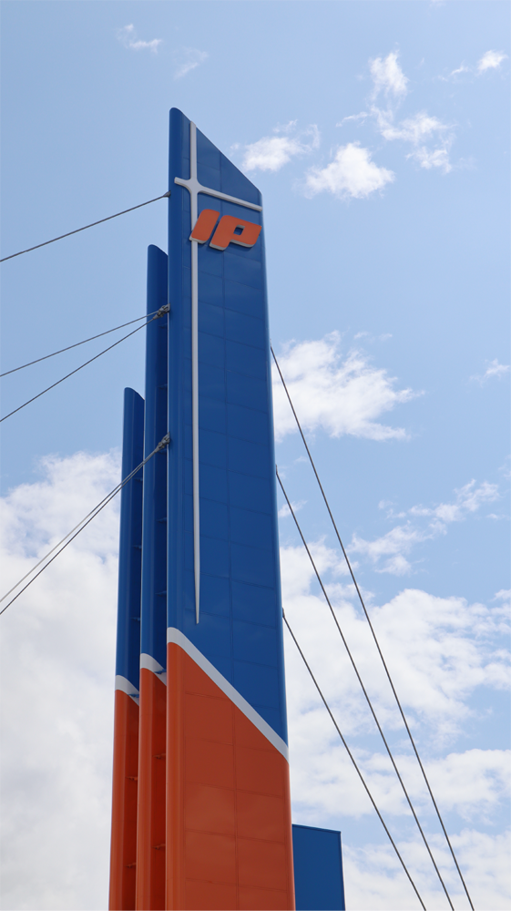
One of the most complex and significant elements of the project was the restyling of the three imposing towers, the tallest one reaching 40 meters in height. These towers define the entire complex, representing the most visible and distinctive body of the structure.
One of the main challenges was the complete cladding of the towers using aluminum composite panels, designed in three different colors that wrap around and run across the entire surface of the towers. A further distinctive element is located on the front of the tallest tower: the boxed signs featuring the brand’s iconic “star” symbol and logo. Both are equipped with integrated lighting, and their installation posed a significant challenge, due to both the elevated position and the imposing size of the signs.
Completed in 2020, the project highlights our expertise in servicing special projects and our ability to realize large-scale solutions, structured to ensure an instantly recognizable and memorable visual impact.
For the IP client, the organization of the site was taken care of with the coordination of the companies involved in the works. The “ERG” image was removed from the entire complex and replaced by the new visual identity.
The new branding was applied to the entire structure, starting with the canopy fascia under which a continuous perimeter orange LED strip was installed. The use of the brand’s primary color ensures greater recognizability during nighttime hours.
The main logo is now represented by the redesigned suspended cube, equipped with new LED lighting, ensuring uniform illumination and providing excellent readability even from a distance.
One of the most complex and significant elements of the project was the restyling of the three imposing towers, the tallest one reaching 40 meters in height. These towers define the entire complex, representing the most visible and distinctive body of the structure.
One of the main challenges was the complete cladding of the towers using aluminum composite panels, designed in three different colors that wrap around and run across the entire surface of the towers.
A further distinctive element is located on the front of the tallest tower: the boxed signs featuring the brand’s iconic “star” symbol and logo. Both are equipped with integrated lighting, and their installation posed a significant challenge, due to both the elevated position and the imposing size of the signs.
Completed in 2020, the project highlights our expertise in servicing special projects and our ability to realize large-scale solutions, structured to ensure an instantly recognizable and memorable visual impact.


